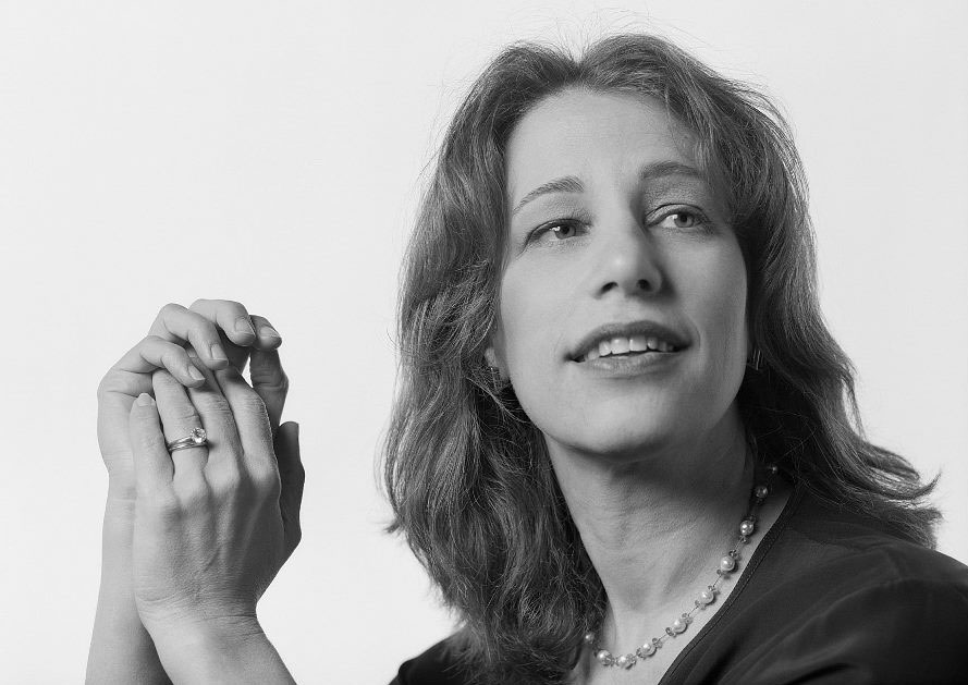
Susan Kare – Designing the GUI of the Apple Macintosh (and much more)
Susan Kare is an artist and designer and pioneer of pixel art; she created many of the graphical interface elements for the original Apple Macintosh in the 1980s as a key member of the Mac software design team, and continued to work as Creative Director at NeXT for Steve Jobs.
She was born on February 5, 1954 in n Ithaca, New York. Her father was a professor at the University of Pennsylvania and director of the Monell Chemical Senses Center, a research facility for the senses of taste and smell. Her mother taught her counted-thread embroidery as she immersed herself in drawings, paintings, and crafts. She graduated from Harriton High School (Rosemont, Pennsylvania) in 1971. In her high school years, she met Andy Hertzfeld, who would later become one of the key software engineers at Apple in the development of the Macintosh.
She graduated summa cum laude with a B.A. in Art from Mount Holyoke College, a private liberal arts women’s college in South Hadley, Massachusetts, in 1975, with an undergraduate honors thesis on sculpture. She received a M.A. and a Ph.D. in fine arts from New York University in 1978 with a doctoral dissertation on “the use of caricature in selected sculptures of Honoré Daumier and Claes Oldenburg”. Her goal was “to be either a fine artist or teacher”.
Susan Kare’s career has always focused on fine art. For several summers during high school she interned at the Franklin Institute for designer Harry Loucks, who introduced her to typography and graphic design while she did phototypesetting with “strips of type for labels in a dark room on a PhotoTypositor”. Because she did not attend an artist training school, she built her experience and portfolio by taking many pro-bono graphics jobs such as posters and brochure design in college, holiday cards, and invitations. After her Ph.D., she moved to San Francisco to work at the Fine Arts Museums of San Francisco (FAMSF), as sculptor and occasional curator.
In 1982, Kare was welding a life-sized razorback hog sculpture commissioned by an Arkansas museum when she received a phone call from high school friend Andy Hertzfeld. In exchange for an Apple II computer, he solicited her to hand-draw a few icons and font elements to inspire the upcoming Macintosh computer. However, she had no experience in computer graphics and “didn’t know the first thing about designing a typeface” or pixel art so she drew heavily upon her fine art experience in mosaics, needlepoint, and pointillism.
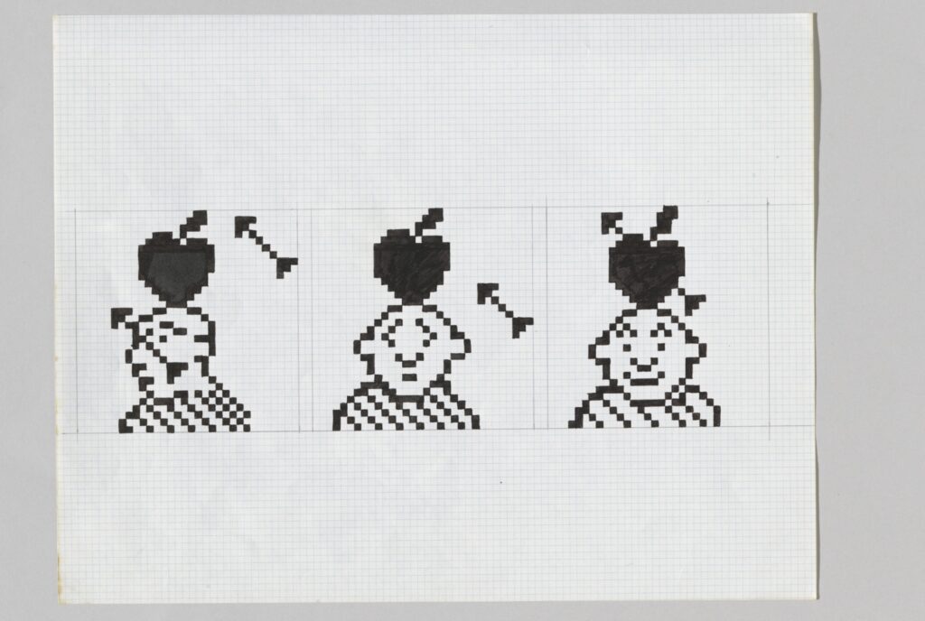
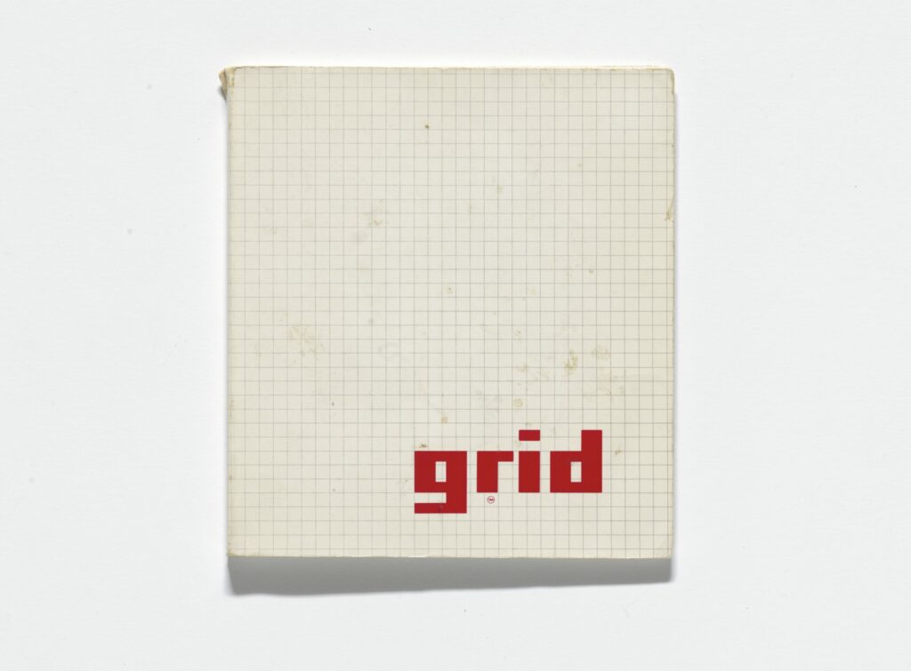
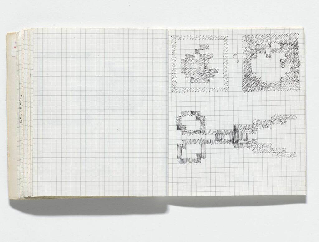
Hertzfeld suggested that she get a US$2.50 grid notebook of the smallest graph paper she could find at the University Art store in Palo Alto and mock up several 32 × 32 pixel representations of his software commands and applications. This includes an icon of scissors for the “cut” command, a finger for “paste”, and a paintbrush for MacPaint.
Compelled to actually join the team for a fixed-length part-time job, she interviewed “totally green” but undaunted, bringing a variety of typography books from the Palo Alto public library to show her interest alongside her well-prepared notebook. “The interview lasted five minutes”, Kare recalled in 2014. “It was, when can you start? And I found myself the next week in the Mac Software Group.” She was officially hired in January 1983 with Badge #3978. Her business cards read “HI Macintosh Artist”.
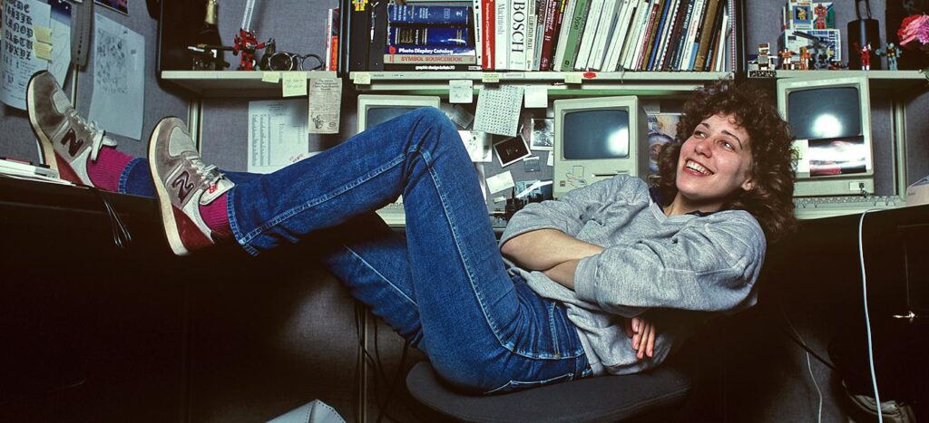
Kare was working on-site in Cupertino. “I definitely learned on the job”, she said in an interview conducted by Alex Pang on 8 September 2000. “As when I went to Macintosh, there wasn’t really an icon editor, but there was a way to turn pixels on and off. I did some work on paper, but obviously, it was much better to see it on the screen, so there was a rudimentary icon editor. First, they showed me how I could take the art and figure out the hex equivalent so it could be keyboarded in. Then Andy made a much better icon editor that automatically generated the hex under the icons. That was how I did the first ones. I think I did the fonts that way, going letter by letter before we had a font editor.”
Susan Kare was looking at a screen like this:
“You can see some of the little rounded wrecks. They have words like trash and disk drive and printer. So those were the things that I needed to make icons for. And on the right, you see the kind of verb of those buttons. “Do it” became “Okay” because “Do it” is maybe more clear but people read it as “Dolt” (a stupid person).
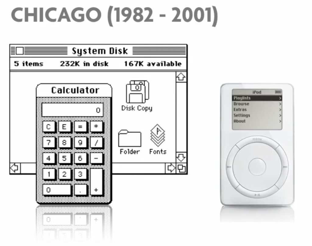
Among her first Macintosh designs were the Elefont, Overbrook, Merion, Ardmore, and Rosemont typefaces, which, however, were named after Chicago, London, New York, and other world cities after objections from Apple CEO Steve Jobs. Susan Kare then took on “icons” to operate the computer, drawing on art historical antecedents such as mosaics.
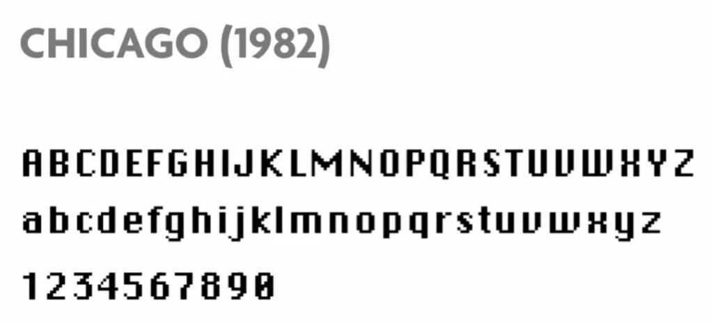
“The first thing I did in a seven pixels wide, nine pixels high typeface Chicago, that I tried to make bold and not have jagged edges. The typeface Chicago ended up in the title bars. And it ended up having a bit of another life in the first iPod.
Kare: “So, when I got there, the goals were explained to me that it (the Macintosh) was a computer for people who were not computer literate so your mom could use it. Not too politically correct. And that it should be discoverable like our cade games, you shouldn’t have to have to use the manual to be able to do it and that it should be friendly. So, I started out making these icons in 32 by 32. This was an icon, I designed. They just said there should be something on the screen. 32 by 32 dots that sits there while the computer boots So I know that I reached back to my junior high favorite symbol to do that (the smiley).”
Kare was also asked to design an icon for a system crash. “I designed this image as a bomb because I was told they would never be seen by anyone. So I thought I could be a little irreverent. But unfortunately, that was not the case. But the programmers truly thought at the time, they would be deeply hidden.”
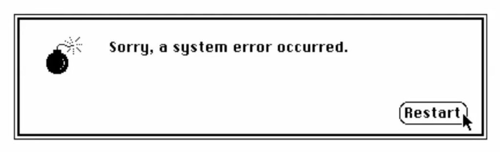
At the EG conference in May 2014, Kare shared an amusing anecdote about the bomb icon: “Right after the Mac had shipped, we were in our software area and a call came in – fielded through apple, and it was a woman who was using MacWrite. It had crashed and she was afraid her computer was going to blow up. So I felt kind of bad.
Susan Kare, Iconographer (EG8) from eg on Vimeo.
There weren’t any tools on the Mac to make icons. “So I did it on paper. And then Andy Hertzfeld wrote this icon editor that allowed you. (to make icons) I mean, it seemed so fantastic. What you could do is turn one pixel off or on.”
“You could draw a line or circle or anything and then you could see it magnified and edit the size that you’d see it on the screen. And it generated the code, you needed for the programmers to get it into the software.”
The smiling Mac, the bomb with the fuse, the clock, the floppy disk, and the wastebasket are legendary.
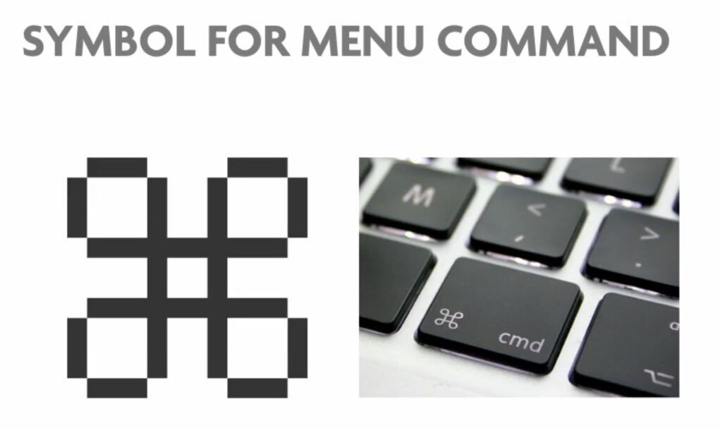
But she found the loop square for the Apple command key in a symbol dictionary; it originated in ancient Scandinavia and later served as a marker for landmarks.
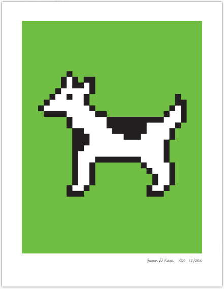
She created a plethora of “dingbats” for her writings, including a cute animal symbol that combines features of a dog and a cow. As Clarus the Dog Cow, it now has its own fan base.
Sometimes for fun, Susan Kare did pictures of her colleagues in icon format. Her digital portrait of Steve Jobs became quite famous.
Susan Kare worked only three years at Apple. But this experience put her on the leading edge of a whole new field of graphic design. Working with only a grid of pixels, she began to master a peculiar sort of minimal pointillism. She spent her days turning tiny dots on and off to craft instantly understandable visual metaphors for computer commands.
Initially, her job was to shape individual letters and numbers to bring a semblance of print’s elegance to the grainy domain of computer screens. But Kare’s most memorable legacy is the playful quality of some of her icons. She’s quick to point out that Xerox PARC had already created a garbage can for disposing of files, but Kare’s can is so viewer- riendly that one half-expects Oscar the Grouch to pop out.
Susan Kare: Life after Apple
In 1986, Kare followed Steve Jobs in leaving Apple to launch NeXT, Inc. as its Creative Director and 10th employee. She introduced Jobs to her design hero Paul Rand and hired him to design NeXT’s logo and brand identity, admiring his table-pounding exactitude and confidence. She created and re-created slideshows to Jobs’s exacting last-minute requirements.
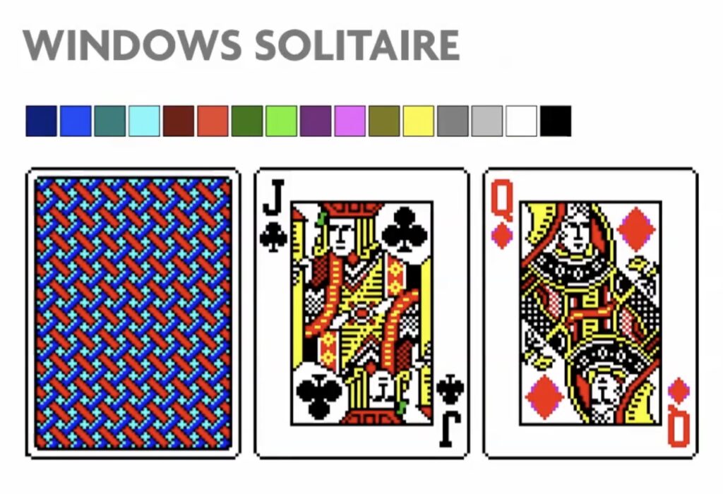
She realized that she wanted “to be back doing bitmaps” so she left NeXT to become an independent designer with a client base including graphical computing giants Microsoft, IBM, Sony Pictures, Motorola, General Magic, and Intel. Her projects for Microsoft include the card deck for Windows 3.0’s solitaire game, which taught early computer users to use a mouse to drag and drop objects on a screen.
In 1987, she designed a “baroque” wallpaper, numerous other icons, and design elements for Windows 3.0, using isometric 3D and 16 dithered colors. Many of her icons, such as those for Notepad and various Control Panels, remained essentially unchanged by Microsoft until Windows XP.
For IBM, she produced pinstriped isometric bitmap icons and design elements for OS/2. For General Magic, she made Magic Cap’s “impish” cartoon of dad’s office desktop. For Eazel, she rejoined Andy Hertzfeld and many from the former Macintosh team and contributed iconography to the Nautilus file manager which the company permanently donated to the public for free use.
Between 2006 and 2010, Susan Kare produced hundreds of 64 × 64 pixels icons for the virtual gifts feature of Facebook. For these items, Facebook was charging $1 each. Initially, profits from gift sales were donated to the Susan G. Komen for the Cure foundation until Valentine’s Day 2007. The most popular gift icon, titled “Big Kiss” is featured in some versions of Mac OS X as a user account picture.
In 2007, she designed the identity, icons, and website for Chumby Industries, Inc., as well as the interface for its Internet-enabled alarm clock.
Since 2008, The Museum of Modern Art (MoMA) store in New York City has carried stationery and notebooks featuring her designs.
In 2015 MoMA acquired her notebooks of sketches that had led to the early Mac GUI.
This is an excellent example of the often “invisible” design that goes behind the graphic user interfaces that we use on a day-to-day basis, an intangible piece of design that we all carry in our pockets. Kare’s humble icons were all based on a 16×16 pixel grid; a grid that has expanded ad infinitum into the screens of our desktops, our laptops, our cell phones.”
MoMa Curatorial Assistant Evangelos Kotsioris
In 2015, Kare was hired by Pinterest as a product design lead as her first corporate employment in three decades. Working with design manager Bob Baxley, the former design manager of the original Apple Online Store, she compared the diverse and design-driven corporate cultures of Pinterest and early 1980s Apple. In February 2021, Kare became Design Architect at Niantic Labs. As of 2022, she concurrently heads a digital design practice in San Francisco and sells limited-edition, signed fine-art prints.
Pingback: Conheça 5 mulheres que fizeram a diferença na ciência e na tecnologia
Pingback: Conheça 5 mulheres que fizeram a diferença na tecnologia – Mais Meninas na Tecnologia